

‘Women’s March Rebrand’ Capstone Project
Deliverables:
Logo
A full website prototyped in Adobe XD (homepage,
history, events, donate, and resource pages)
Nine instagram tiles
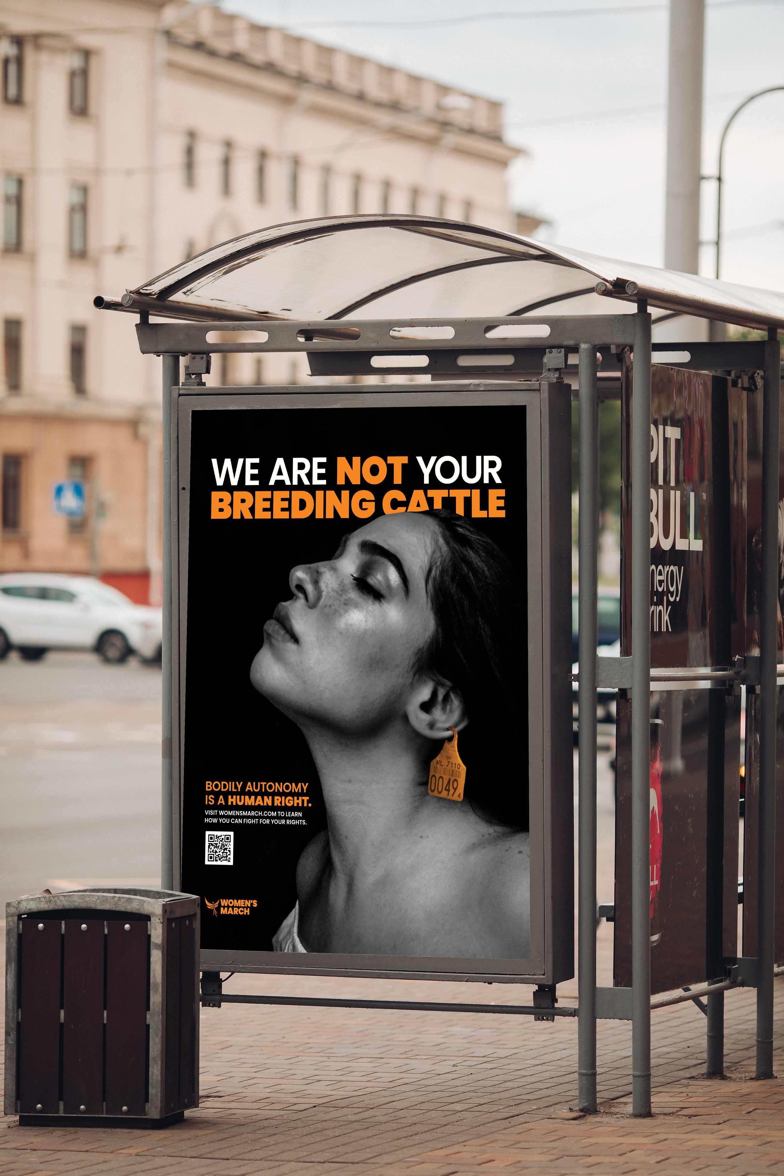
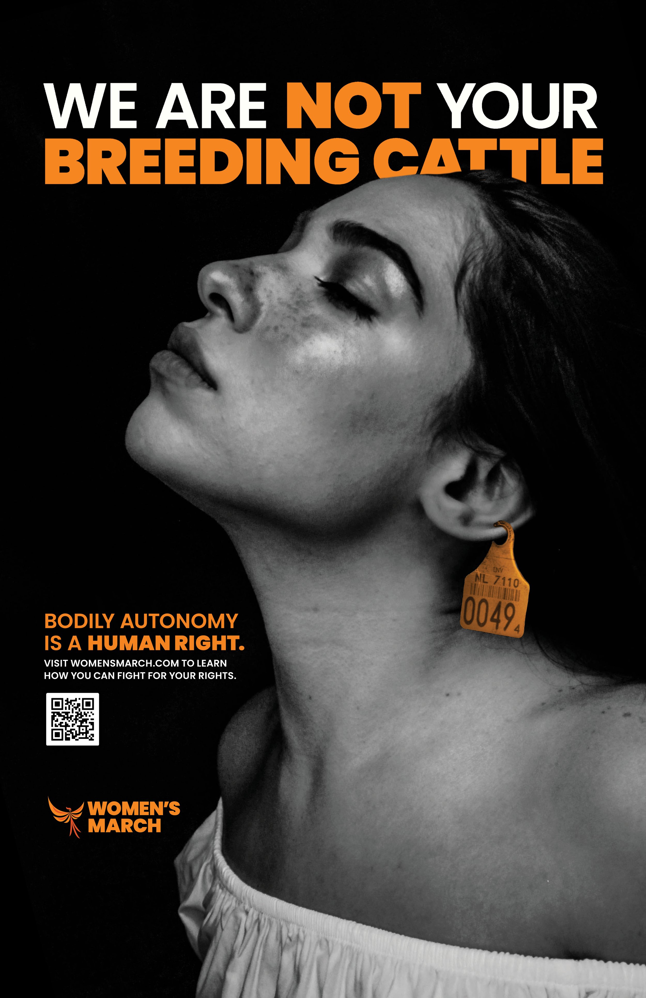
Print Ads
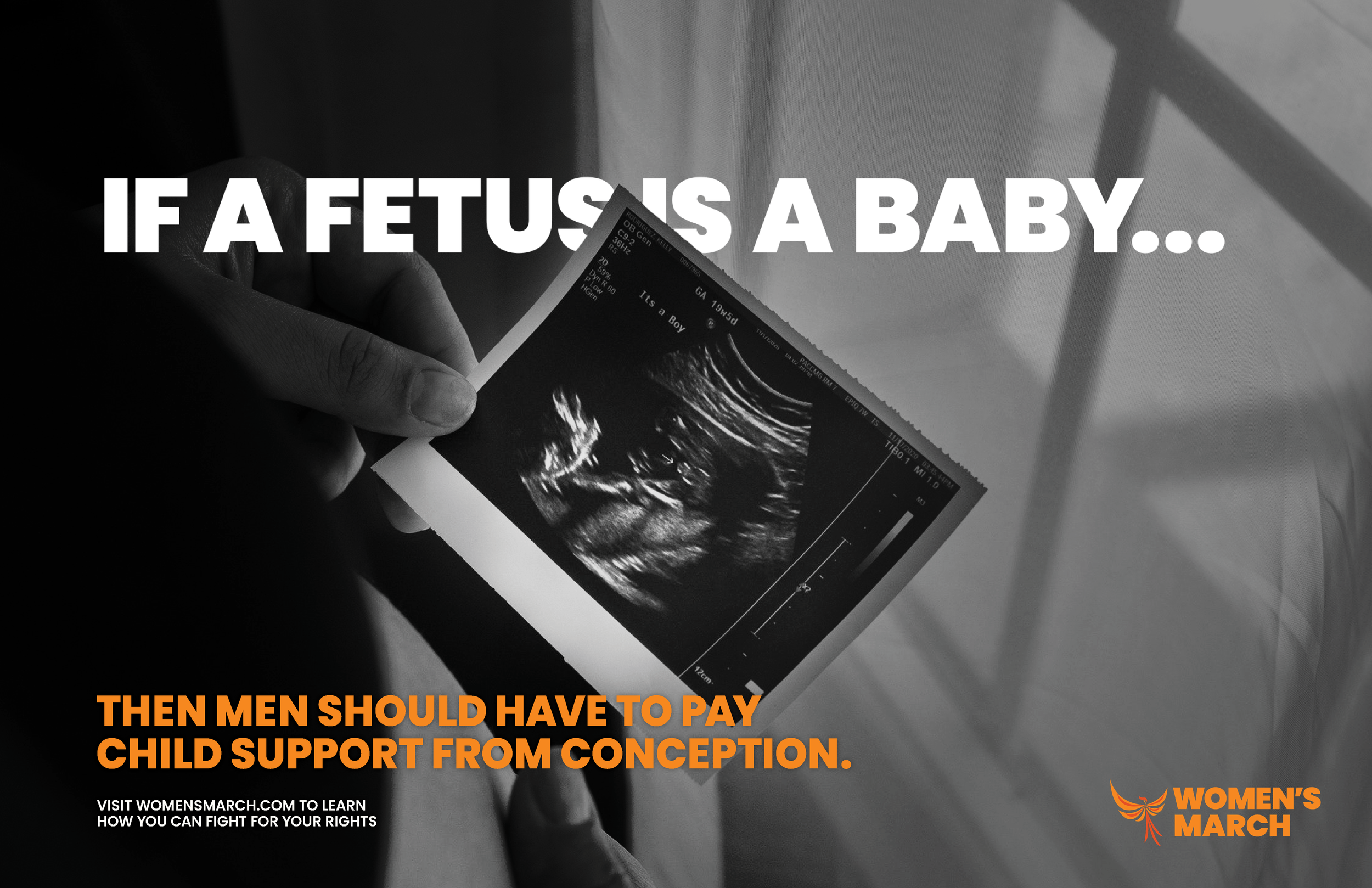
Three poster ads
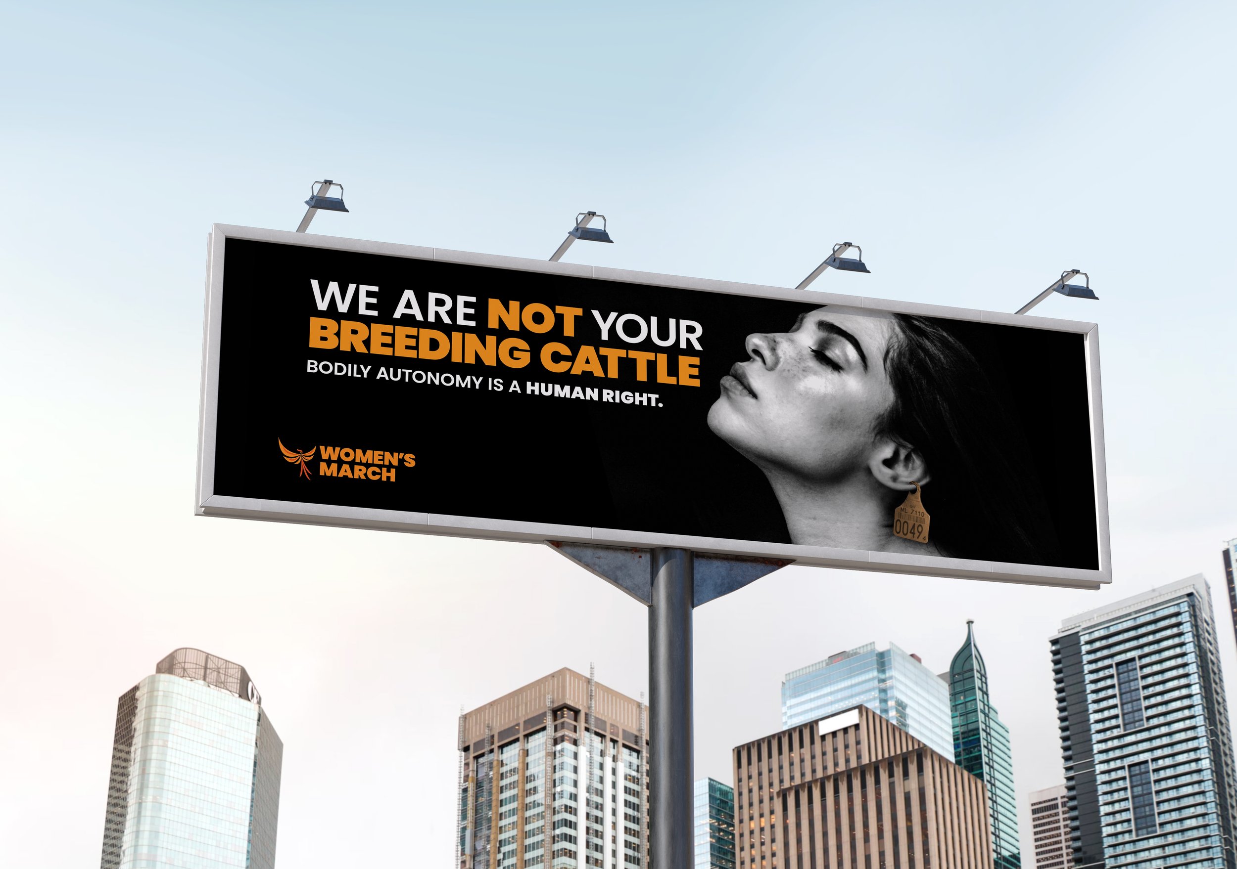
Two billboards
One bus bay ad
Objectives:
To independently research, design, and produce a logo, website, and ad campaign for the Women’s March.
To create a full-functioning website that is user-friendly as well as functional.
To implement design elements into creating an identifiable brand identity that is recognizable, speaks to the brand, and looks modern.
To evaluate myself with critique on any design decisions while also taking into consideration and applying the critique from my peers and faculty.
To research and analyze previous ad campaigns from multiple other organizations in order to strengthen mine.
To maintain the integrity of the Women’s March in order to convey their key messages.
Organization Profile
Women's March is a women-led movement providing intersectional education on a diverse range of issues and creating entry points for new grassroots activists & organizers to engage in their local communities through trainings, outreach programs and events. (Per https://www.womensmarch.com/team)
One of the main issues they focus on is abortion and abortion rights. This makes it imperative that they have a user-friendly website that covers all of the what, where, and whens of pro-choice activism. In order to draw attention to this issue, an impactful advertisement campaign is needed. To execute this deliverable, I used popular taglines I’ve seen on posters when I’ve gone to protests and marches. While they already have an existing website, I decided that I wanted to do a refresh of it in order to add a captivating UX deliverable. People often get the information for events through social media, so I also designed nine Instagram tiles.
Target Audience
The primary target audience is young adults (particularly Gen Z and Millennials) who have reached voting age and are most affected by the future of politics and abortion rights. The secondary audience would be people who have been wanting to engage in activism who want to get out there and help create change, but perhaps aren’t sure where to start. The third target audience would be anyone age 40 to 90, people that can help change the future for their children and grandchildren as well as the younger generations. When identifying target audiences, it is important to know that political affiliation, identity, and issues of different people change as the years go on. Certain people may vote one way in one election and then the opposite way in another.

Research
During the course of this project, a large amount of research was needed. In my research, I examined information about the Women’s March organization as a whole, activism in design and design for change, ad campaigns, and information on UX/UI design practices. I created the moodboard (as seen below) to set the tone for my ad campaign. I needed something impactful and exciting. I drew inspiration from activist designers like Barbara Kruger, the Guerrilla Girls, and Deva Pardue.
Throughout this project, typography was important. I spent a lot of time researching different fonts and type-stacking styles. I decided on Poppins for all elements and utilized different weights and point sizes to create variety as well as contrast. I found Poppins to be especially great because it is a bold font with sturdy shapes that maintain professionalism while still asserting the messages that need to be conveyed. A great deal of color psychology and theory research also went into the project research.
The Process
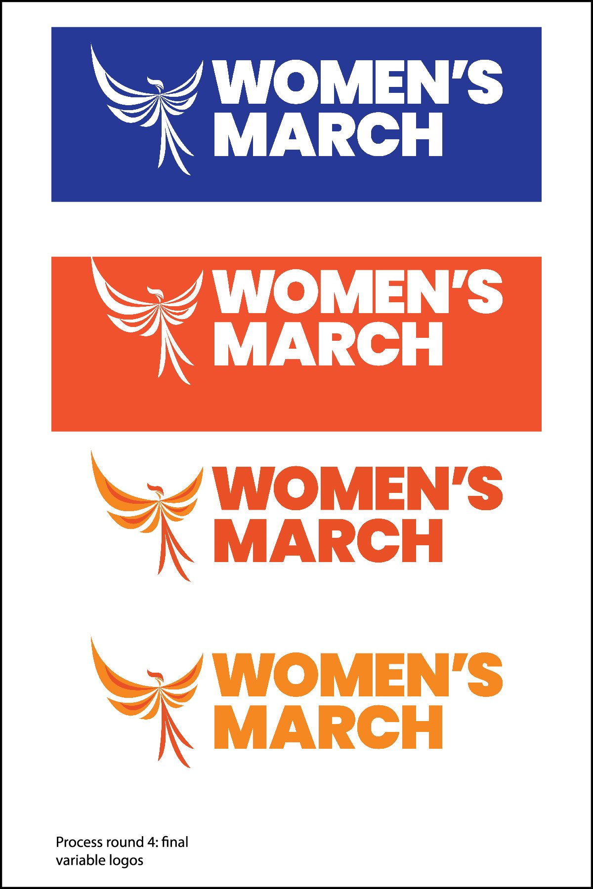
The first part of the project entailed designing a logo. I felt that a strong logo was needed to show the overall boldness of the organization. After processing out a few ideas with none of them being successful, I decided I needed to reroute into a different direction. The old logo sketches seemed rather tame where I needed something strong. This is where the phoenix iconography comes in.
As a phoenix rises from flames, the grassroots activists that the Women’s March rallies also often rise up from their communities to create change. The element of fire also comes into play when we think of “sparking a movement.” These two concepts are a large part of why I designed the logo the way I did. In my research for the logo, I discovered that most phoenix icons looked the same, thus prompting me to try something different. I went for a stylized logo with thick and thin swooshes to show an abstracted shape of flames.


Scroll through a prototyped instagram profile for the Women’s March
The Ad Campaign


The largest deliverable of this project exists as a full website, optimized for viewing on a 1920 pixel screen. Please click the button to access a user-testing prototype.